
Creating a color palette for a website based on a client’s logo is one of the smartest ways to keep everything feeling cohesive and unmistakably on-brand. The logo already carries the heart of the brand’s identity, so pulling colors directly from it builds instant recognition and trust without starting from scratch.
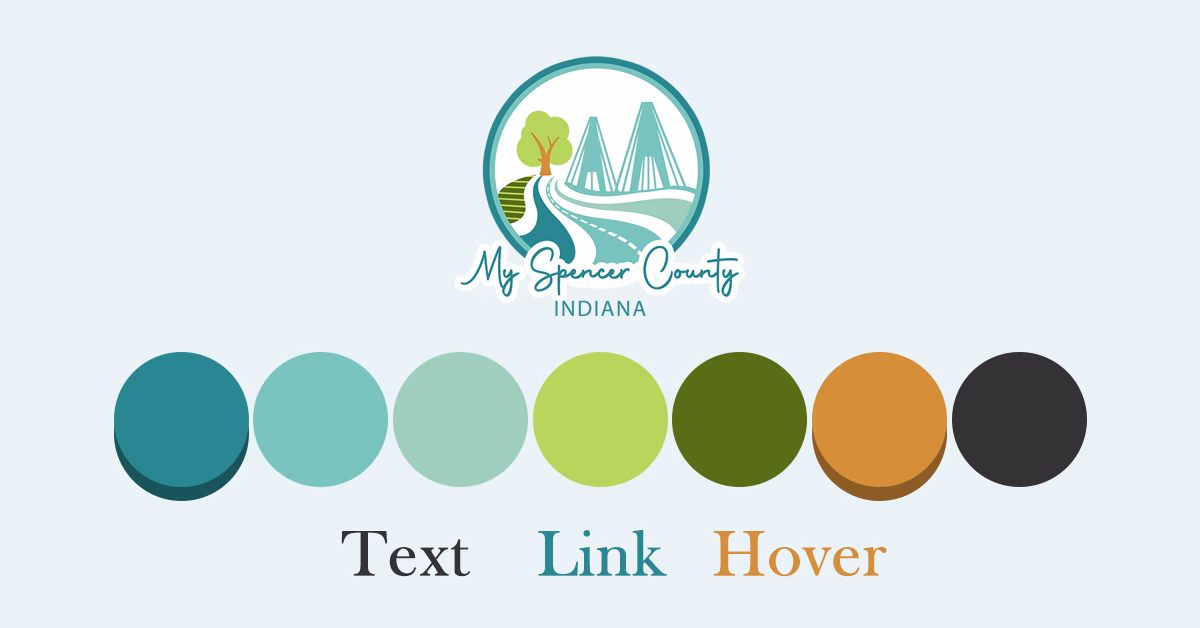
The process starts simple: treat the logo as your main reference point. Upload a high-resolution version (PNG or vector works best) into a color extraction tool like Coolors or Adobe Color. These tools quickly pull out the dominant hues — usually 4–8 shades — and the ones used most prominently in the logo become your core brand colors. Pay attention to the exact shades first, not softened versions, because precision here matters for brand consistency.
From there, organize those colors into clear roles so the website doesn’t feel chaotic. A classic approach is something like the 60-30-10 rule: let the most prominent logo color (often the primary) cover about 60% of the design — think hero sections, headers, or main backgrounds. Supporting colors from the logo take up around 30%, appearing in subheadings, cards, or secondary elements. The boldest or most contrasting logo hue becomes your accent (roughly 10%), reserved for calls-to-action, links, and hover states to draw the eye without overwhelming everything.
You’ll almost always need to expand beyond what the logo gives you. Create lighter tints and darker shades of each core color for things like hover effects, disabled buttons, or layered backgrounds. Add a handful of neutrals too — whites, off-whites, soft grays, and near-blacks — since logos rarely provide a full neutral range. In 2025–2026 designs, most effective palettes stay lean: 5–8 colors total keeps things clean and manageable.
The key takeaway? Anchor everything in the logo, expand thoughtfully, prioritize contrast and balance, and test early. You’ll end up with a website that feels like a natural extension of the brand — professional, intentional, and instantly recognizable.